Silkypix for the HS10 creates a very warm image, as we saw in the last article. It also does a wonderful job with the background detail, as its sharpening algorithm is clearly oriented to maximizing distant details and removing some of the smear that is so prevalent in the jpeg engine. A very good job.
But how about close up subjects? Subjects in light that is not quite so straight forward? Well, the second part in the series on Eye Mind Soul showed a camera body on some sort of cloth (looks like a product photography tent.) The words used in summary at the end are equivocal:
Reality is that ACR does a very good job. I feel, however, that the RFC does it all just a little better.
Why ? I don't know - Does it really matter ?
I feel that the method is again flawed, leading to really unclear differences as noted in the author’s summary. So I will repeat the test with conditions I choose to level the playing field and see what we end up with. The first goal is to get an accurate color balance in this instance. I have no idea what the camera’s color is or what color the cloth is, but I absolutely know what color the white lettering is from the Kodak film box, as it is inserted into the slot on the back of the camera.
So it is a trivial matter to equalize white balance by using the white balance tool in ACR and the grey balance tool in Silkypix. This starts us from the same point and avoids the constant white balance differences that plague the articles on Eye Mind Soul. It also avoids having to say something as was said in step 9 of the referenced article:
However, the white lettering on the ACR image is correct. It is a little 'muddy orange' on the RFC image.
… that comment clearly denotes the significant white balance equalization error in that article. I.e. a lack of white balance equalization :-)
Other than getting the color of the lettering correct to start the process on the right foot (something I would do always and in any converter), the goal is to get a pleasing final image. To this end, these parameters are most important:
- Correct exposure
- Pleasing contrast
- Pleasing saturation
- High sharpness
- Minimal chroma and luminance noise
And I am not working to the goal of equalizing the images as I was in my first article on the topic. That article showed us that the two converters interpret colors wildly differently. Also that Silkypix defaults to an overly warm color balance, which works really well for landscapes (as we saw) but which is going to be a handicap for a lot of other shooting circumstances. Hence, the need to set the correct color balance right up front this time.
Silkypix Conversion
Silkypix creates dark images with warm white balance if left to its own devices. This is illustrated by showing you a version with default settings only. This is what Silkypix thinks the image should look like, and is quite similar in tone to the image shown in the referenced article.
Note: The image used is copyright © 2010 by Dave Lloyd and is used by permission.

It’s somewhat pleasing to look at, but the white letters are not white and it looks like it was shot under an orange light (which I would bet that it was) on auto white balance.
So I boosted the exposure 0.4 stops and used the grey balance tool to set white balance on the white lettering shown here:

The final settings show a color temperature of 4025 and a color deflection towards the blue. I did not touch the dark adjustment slider, as I am presuming that this is a relatively accurate color balance and I want to work within that constraint.

Moving to contrast, I started from the strong contrast preset and tweaked it a bit. The output is very pleasing now (you will see the result momentarily) and I have no quarrel with how Silkypix handles contrast and exposure.

I did not need to explore fine tuning controls like contrast center and Gamma. Nor did I need to tweak the black level, as it was set correctly for this image.
For the color selection, I again chose standard color. In Silkypix, saturation is naturally high, so there was certainly no need to boost saturation in this converter.

Next, set sharpness. I started with the natural fine preset, but then tweaked things a touch. With this image, I found normal sharp to give a nice result, so I did not explore pure detail, as I did in the previous comparison article.

Note the very strong emphasis on detail. This really emphasizes the texture on the back and the little scratches and knocks elsewhere on the body, yet without any halos or other nasty artifacts.
And finally, noise reduction. Silkypix leans to warm images naturally, so when I forced it to attempt an accurate white balance, it appears to have pushed the blue channel very hard, which leads to what looks like extra grain and chroma noise. A bit of mottling. So for the noise reduction panel, I addressed both as best as the tool could without destroying the detail.

You can see false color control at max and noise reduction at 1/5. Any higher starts to impact edges and smaller details. Noise cancel was also dialed up to above 1/3. The result is pleasing enough, but Silkypix really does not seem to be able to successfully neutralize an image. This is no doubt why all the images I see from it are so warm.
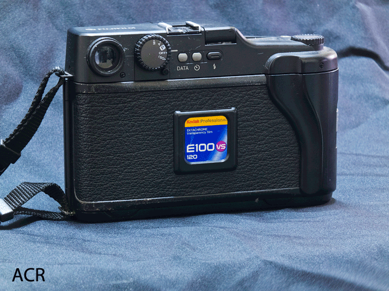
So let’s look at the image:

Too much blue, but otherwise very nice at this size. We’ll compare crops after we look at the ACR conversion process.
Adobe Camera RAW
ACR has a rather different idea of how the final result should look.

Also warmer than what white lettering would give you, but not to the same extreme as with Silkypix. So again, we hit the white balance tool on the lettering to start with.
Other adjustments on the main panel are:

ACR sets the white balance a bit warmer than Silkypix, but also trims it towards the blue end of the spectrum. I slightly boosted exposure, but less than in Silkypix since ACR does not make naturally dark images. I used 100% recovery to pull back on the specular highlights where the camera body is shiny. I did not change black level at all, not was there a reason to add fill light. Brightness remained untouched but I tweaked contrast somewhat. I also added some clarity for the texture on the back and boosted vibrance and saturation a bit to add some pop to the film label.
I was not satisfied with the contrast as set by the slider, so I visited tab two this time and started from a strong contrast preset, then tweaking the contrast by eye. This custom curve gave me what I consider a very pleasing result:

Jumping forward to camera calibration, I again made sure I was using the new process and the only color and tone profile available for this camera.

I touched nothing else here. The second last panel was lens correction, where instead of the fun I had to correct the distortion in the last article, I let the existing custom profile do its work:

And then we visit the tab I generally spend the most time in, sharpness and noise reduction. Here, the balance between detail and noise is struck, and for small sensors this is often quite tricky. Small sensors (and the HS10 sensor is unbelievable small – half way between 1/4 and 1/3 of a square centimeter) have very high pixel densities and thus are using a lot of noise control even at their lowest ISOs, and this shot is one step up from base ISO. So we need to replicate that, as we tried in Silkypix with less than shining success.
ACR 6 is known, however, for its noise handling. It is nothing short of astonishing, especially where chroma noise is concerned, and I look forward to a great result.

As with the previous article, I had to use quite a bit of sharpening to counteract a fairly strong dose of noise reduction. But here the noise reduction is more concentrated on chroma noise, and thus the luminance noise and sharpening values are somewhat less intense than in the previous article. What has really changed between the articles is that this is a close up at a more moderate focal length, playing to the strong range of the lens and keeping details, even tiny ones, much larger than they were in the previous image.
So … a quick peek at the final image before we begin comparing them for serious … (Zoolander reference for the terminally film-challenged.)

So, not unlike the Silkypix version, but with the blue channel much better controlled. The camera body looks more realistic in my opinion. But let’s take a closer look and see what these converters are doing.
Direct Comparison of the Outputs
First, the lettering. Where did it end up?

Well, measuring at the top-middle of the E, Silkypix has pushed it just a hair to the blue green and has higher luminance. I quite like it. ACR has it as a slight tint of brown and luminance is lower. The surrounding clip, though, is tilted to the blue on both, but this is more visible on the Silkypix conversion. Again, the blue channel is boosted too much.
Next, let’s examine the top edge of the camera for it’s curves, and the back for it’s lovely texture.

Hmmm … the 3-dimensional nature of the top lip is quite visible on both, but more pronounced in ACR because of cleaner edges. In fact, the noise reduction in Silkypix has been fairly unsuccessful at this level of magnification.What one notices very quickly with Silkypix is that it requires an extremely light touch on the noise reduction controls. Any strength and the converter will rapidly change the texture to something that looks like a painting. This is very much a Fuji thing, and I wonder if they perhaps donated their noise algorithms from cameras like the F30, which were known for going painterly to vanquish noise.
And of course the blue cast is very evident here. I am struggling with my bias towards ACR where noise handling is concerned … it really is that good. But I can’t really call this anything but an almost crushing defeat for Silkypix. ACR really has the chops when it comes to noise handling, so no amount of sharpening prowess on Silkypix’s part is going to be able to counteract its rather weak showing here.
Moreover, the problem in the blue channel for Silkypix is showing up everywhere now.
Moving on. Let’s look at the glass entry to the viewfinder:

Again, the blue channel is too obvious. As with each of these crops, we are seeing all the details, but we are also seeing a bit of a fog over the detail in the Silkypix version. This is likely caused by its noise reduction, which does not appear to be in the same league as ACR.
With the ACR image, you see very fine grain, in the bottom half of the viewfinder this is very apparent. But the noise is more of a mottling in the same part of the Silkypix version. This larger clumping of the noise shows its effects everywhere. The threading inside the viewfinder is perfectly crisp with ACR and again slightly softer with Silkypix. The reflection in the glass takes on a slightly painterly look in Silkypix, as was noted earlier. And the scratches top right have almost a glowing quality in the Silkypix conversion, whereas the ACR conversion shows them with perfect crispness. Great edge details.
Finally, let’s look at the mode knob and the data and power buttons.

Same story here. I quite like what ACR has been able to do. Not so fond of Silkypix here. I suppose this tells us that ACR gives you the freedom to work with the light you have and push things around quite a bit. It’s noise handling is second to none and that gives you latitude to push your processing.
Silkypix, on the other hand, is not comfortable at all in this kind of light. You have to let it go with its overly-warm interpretation in order to avoid excessive blue channel contribution and issues around noise reduction. And even then, I am not sure at all that it’s Fuji-inspired painterly approach to noise reduction offers much freedom. Once you have to push the dials at all, you see detail going away at a frightening pace (try it if you don’t believe me.)
So I remain a confirmed ACR user. But, to be perfectly fair, with landscapes in strong sunlight I can certainly see Silkypix being a valuable tool. For anything else though, I am pretty sure ACR will perform to a higher standard.
I’ll leave you with an animation of the two final results …
No comments:
Post a Comment